
DESIGN
They wanted new design and ideas to use in the future for their product line Resorb.
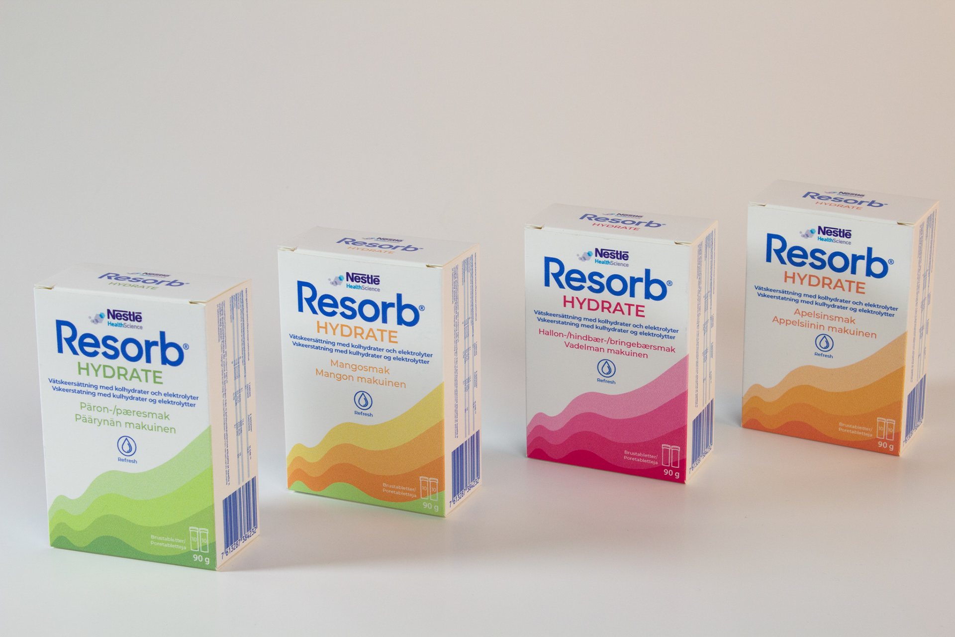
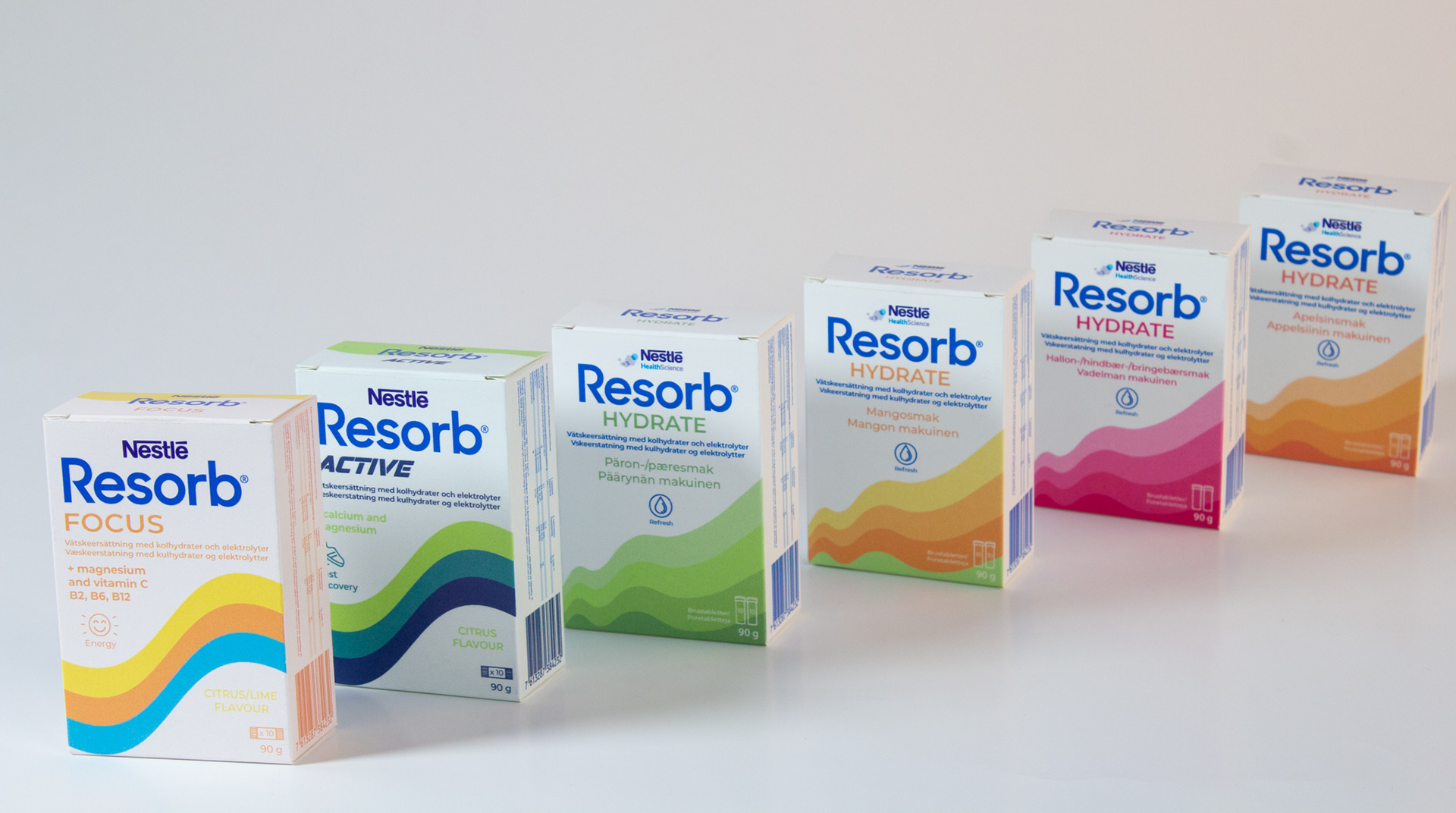
We decided to update their current design to target different target groups but to still keep their recognisable wave that Resorbs has to make sure their old target group does not get confused.
I was in charge of illustrations, icon and typography.
CONSTRUCTION
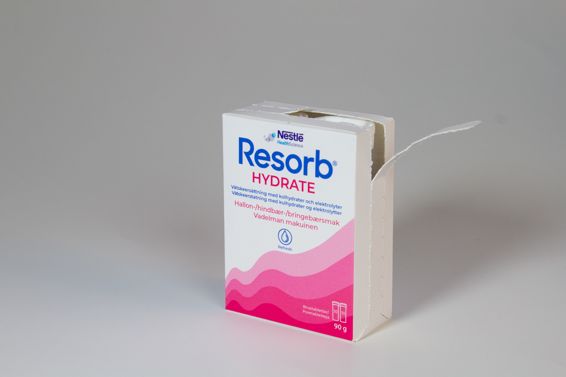
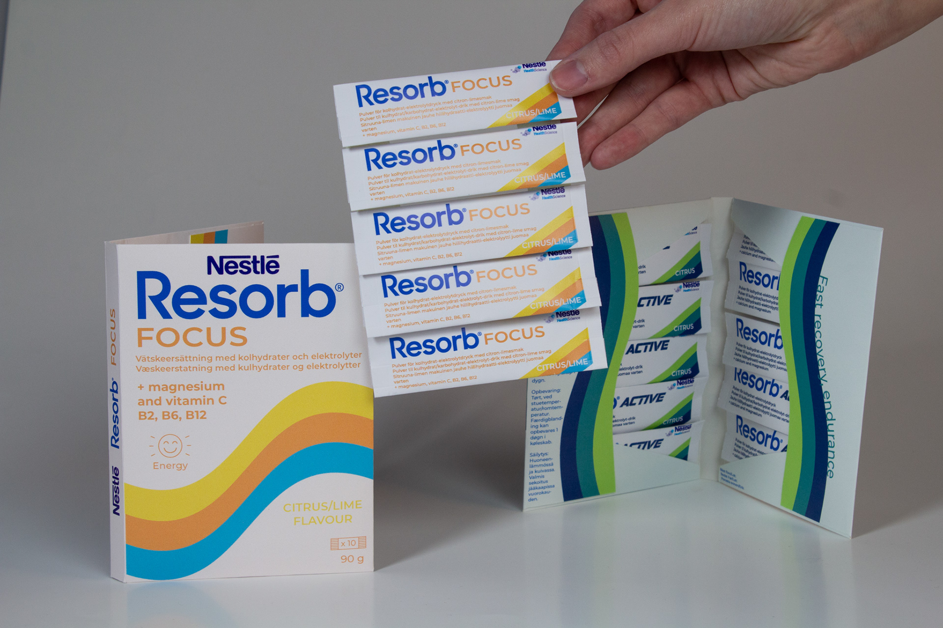
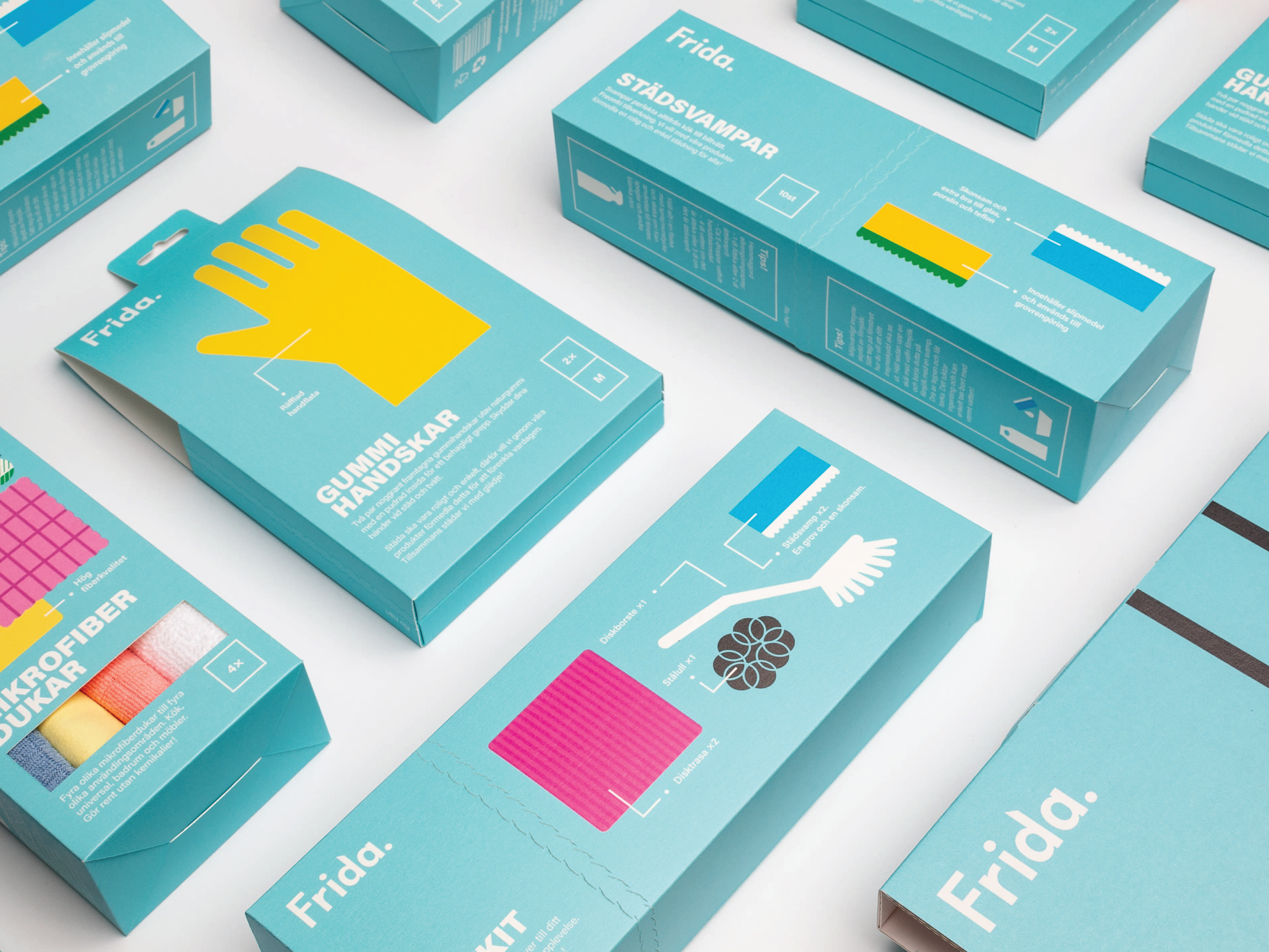
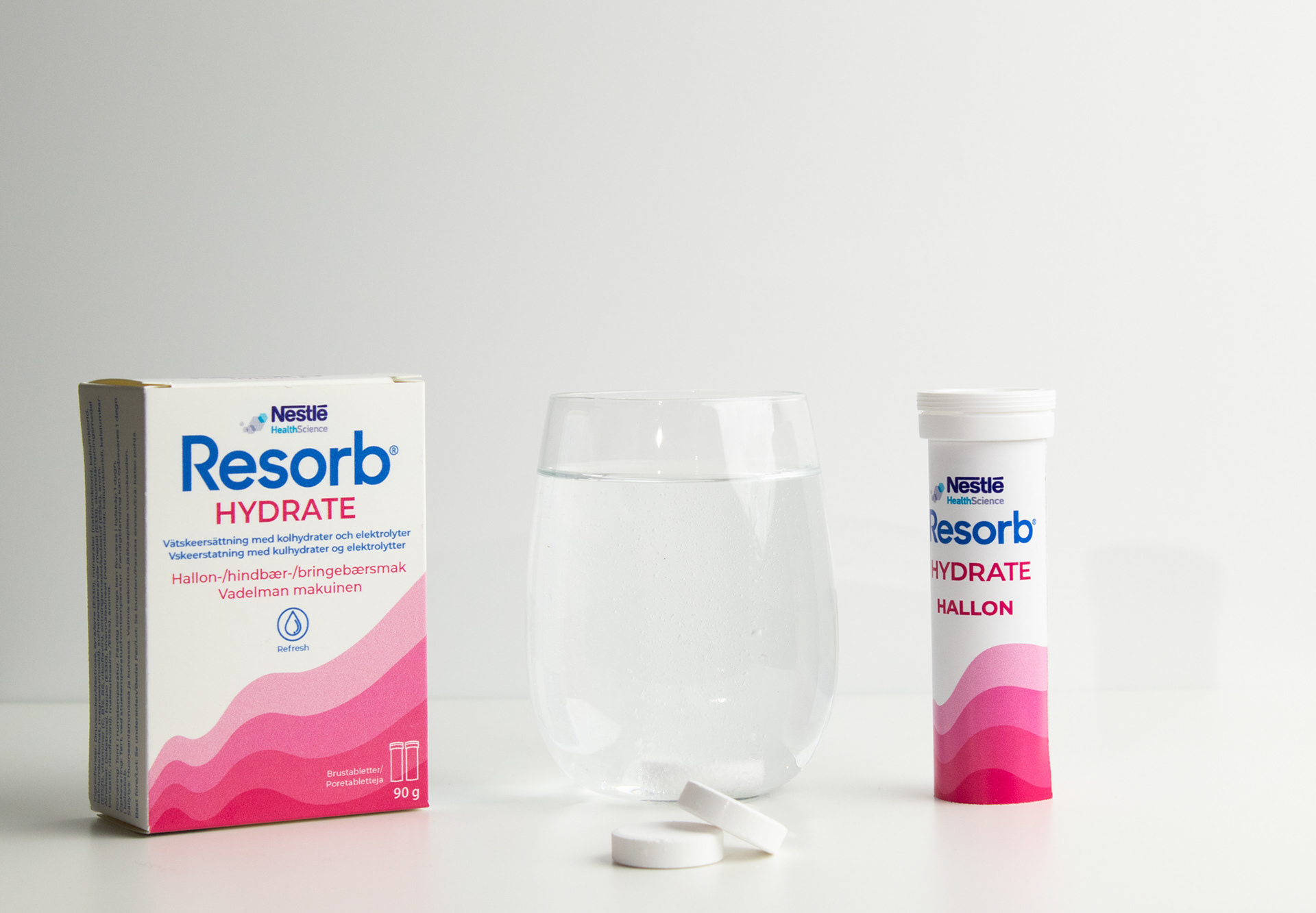
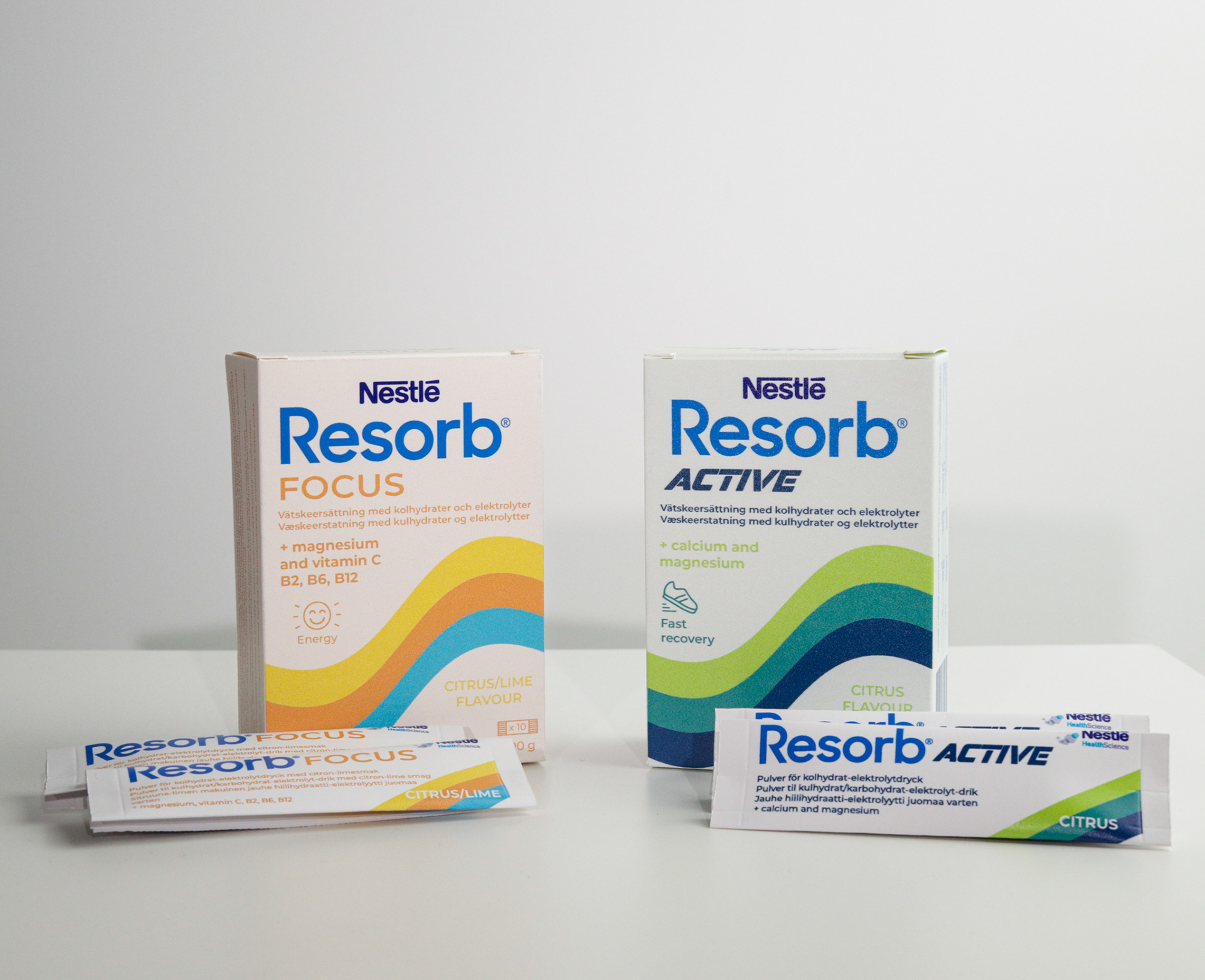
We also got the freedom to change their packaging as you see on picture. We decided to give our users an easier time to open the tablet and powder packaging.
The inspiration for the tablets was to make use of our knowledge of a fun way as well as easy to open packaging, zippers!
For the powder packaging we had the idea of using the type of packaging we have seen condoms have, really fun discovery!